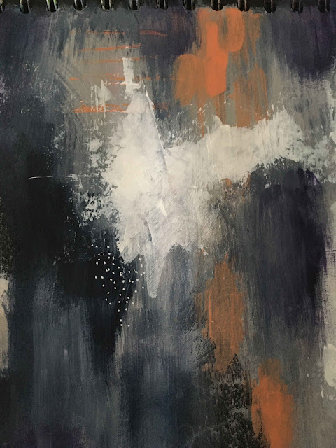
I'm drawn to the contrasts of dark and light in my art adventures at the moment. I picked up a tube of Payne's Grey last week and am loving using it to shade from the black of the paper into a deep blue colour, along with the purple I picked up recently.
I haven't found any words for this page yet, apart from the ones that went on as the first layer. You can just see them poking through as white squiggles towards the bottom of the page. Maybe that's how this one needs to stay - the hidden words of the first layer rather than the public ones that often go on at the end.
Do you use words in different layers of your pages? Or maybe you don't use words at all. It's your journal - do what works for you!


Luscious colour, Tracy, and I agree that Payne's Grey is a fabulous colour to use! I often use both hidden and 'in plain sight' text in my journals, and have a fondness for the energy that the hidden words can bring to a piece!
ReplyDeleteIt's amazing how those hidden words can shape a piece and affect the layers that go on top, isn't it?
Delete