Friday, 6 March 2015
Peering over the parapet
I had no idea where this page was going until I stuck the gelli-printed scrap on at the bottom right. It was turquoise with yellow/green eye shapes. They just wanted to be eyes!
But that makes it a strange place to put a face on the page. When I finished the face it looked as if it was peering over a wall. It made me think about how, some days, it feels as if we are peering over the parapet and dodging bullets. Some days you would just rather be in bed.
Wednesday, 4 March 2015
Walking the plateau
It can feel exhilarating to reach the peak after a period of growth.
But the plateau afterwards can feel almost like a trough, as if nothing is happening.
But the thing is, you need to walk the whole length of the plateau to reach the next lot of foothills. There is nothing else for it. If you want to continue to grow, you can't just stop because it feels like nothing is happening. To climb another peak, you have to walk the plain.
A constant climb is tiring.
We should embrace the plain, enjoy the rest, prepare for the next peak.
Monday, 2 March 2015
Circle journal - Beverley's journal
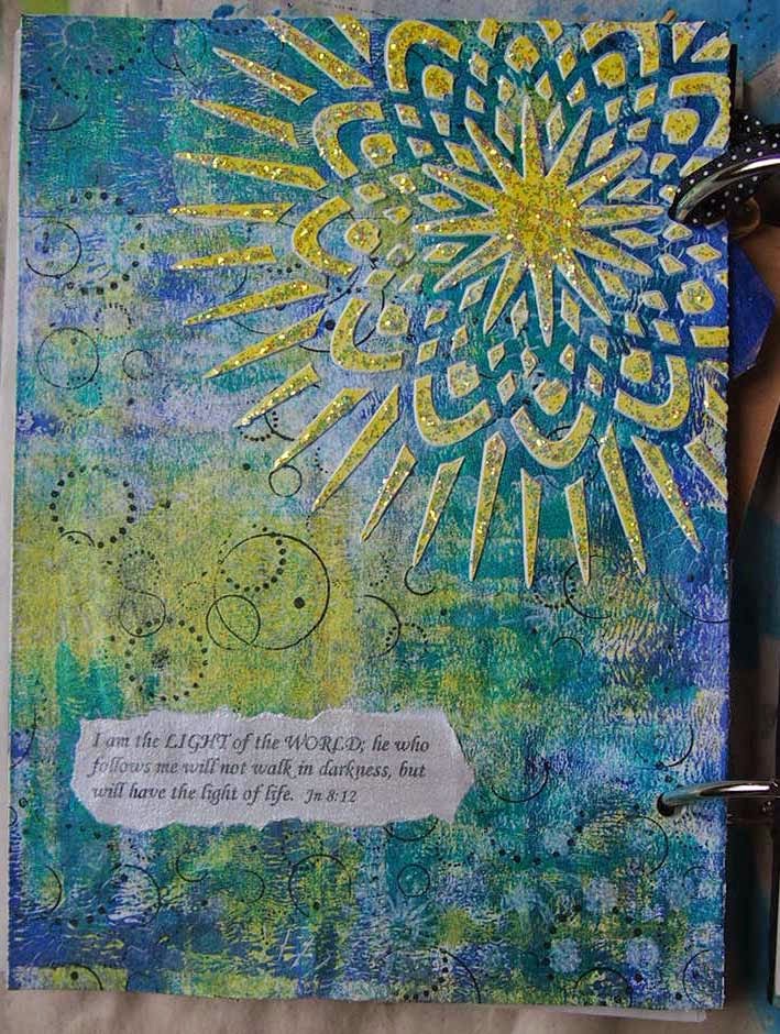
My second round in the round robin/circle journal is Beverley's journal. Her theme is light shines in darkness.
My immediate thought on reading those words is and the darkness has not overcome it as it says in John 1:5. However, Beverley has already used that one (darn!) So I had to come at the subject from a different direction.
My first page (which is actually the one below, not the one above) didn't come out at all as I imagined. I couldn't seem to make it go in the direction I wanted it to. The pattern on the tissue paper with the wording that I wanted to use ('illuminated living') was too dark. I ended up covering up the pattern. Then I put the dimensional star on it and felt that I then had to work around it. My thought was that the star over Bethlehem was a guiding light and what do we use to guide us? I'm not that happy with the page, but there you go.
The second page (the one above) I was much more happy with. I did the candle and the rays with masking fluid. The halo around the flame was made with gesso. A smear of water-soluble pastel around the edge and a little bit of stencilling, and done. I feel that the image and the words go well together.
Beverley put tags in for each person to label their page. Here's mine:
Beverley's journal is richly textured front and back and put together with hinged rings:
I like the hinged rings as it meant that I could take my page out and work on it without fear that I might accidentally contaminate someone else's work. Also, it allows for dimensional work, as can be seen by the other pages that have already been done. Here are Susan's pages which she has blogged about here:
And these are Beverley's pages:
And the title page:
This is my tag at an angle so you can see the shiny sticker:
Beverley's journal will be on its way to Kim soon and I shall wait (im)patiently for the next one :)
Sunday, 1 March 2015
Sequin waste, lace tape, and a toilet roll tube...
This is one of those pages where I was having fun just laying down colour and pattern, and now I look at it and wish that I had taken some progress photos! Never mind.
I had no thought as to what this would look like when it was finished. Just started with a layer of gesso and then went at it with sequin waste and spray inks to start with.
I also stuck on a piece of hand-made paper with a rose stencilled on it that was sitting on my desk - a leftover from some try-outs my daughter was doing. If you're looking hard to see it, it isn't there anymore. It was one of those pieces that I placed and then wished I'd left until the end. I loved the way it looked, but it just wasn't working when other layers were added. It started to disintegrate. In the end I peeled it off and put the tag in its place.
I'm not really one for lace, but I found this lace tape in a dollar store - 3 different widths - and I felt it calling to me, so on it went. I think I did the orange glaze next - a mix of Chromacryl clear gel medium and orange watercolour. This filled all the white that was left after spraying through and printing with the sequin waste.
Then I went back in with the sequin waste but used some acrylic paint applied with my finger (hey, it was the nearest thing to use!). Paint went underneath, but that left some lovely dark-rimmed circles. Bonus! This was about the point at which the hand-made paper came off and the tag went on.
I wanted another layer, so this is the point at which the burgundy leaf shapes went on. They looked a bit stark, so I pushed them into the background a bit more with some white outlining. Much better. A bit of drippy spray helped, too.
A handy toilet roll tube stamped on to an ink pad made the black circles in which I journalled some thoughts, and the page was done.
Friday, 27 February 2015
Control
It's easy for us to react to things out of pain, anger, distress, bitterness.
But we have control over how we react.
The left side of this page represents our feelings and the chaos of what can be said and done against us. The right side is white space - clean, serene, calm, peaceful.
I want to react out of the peace inside me not to the barbs aimed at me.
Wednesday, 25 February 2015
Take Me Deeper - week 8
John 13:34-35 this week - a new commandment, to love one another.
On the surface this can seem to be a very simple idea - love one another. How hard can that be?
But it isn't 'love one another as long as the other person loves you back.'
It isn't 'love one another if the other person deserves it.'
It isn't 'love one another if you feel like it.'
No. This is a command, not an option, and it includes those who are hard to love. But thankfully loving someone doesn't have to mean that you have to like them. Loving them means showing them the care that is due to another human being because they are made in the image of God.
Monday, 23 February 2015
Friday, 20 February 2015
Flourishing or floundering?
Is my hand reaching out to stretch and grow?
Or am I reaching out for help?
Reminded of e. e. cummings, am I waving or drowning?
Some days it is hard to tell.
Thursday, 19 February 2015
Overwhelmed
I started this page in landscape, but halfway through felt the urge to turn it around. It certainly looks different when you do that. Suddenly the page was top-heavy, so enter the tag.
This page also started out as shades of grey, but then the blue crept in, which was OK because it was a blue/grey. Then the yellow popped up. What's a girl to do? So I went all out with the shiny tape as well.
It all turned out a bit busy, which is kind of how my head feels right now.
Wednesday, 18 February 2015
15 minute page
So here is my own video of a quick page made with just a few supplies. The face was already done and I knew I wanted to use it, but I wasn't sure how. Putting the camera on applies a certain pressure. As my camera is a time-lapse one, all the editing and speeding up is done in-camera. I can't alter things afterwards. So I don't want to spend too long deciding what I am going to do. The pressure is on to just get on with things and not think too much about it.
Although it is a pressure, it can also be freeing. The page might not turn to be one I like, but it provides an oasis of peace just putting colour and pattern on the page.
Subscribe to:
Posts (Atom)