Showing posts with label time-lapse video. Show all posts

Monday, 10 July 2017

High-rise worries


It's been a little while since I pulled out my Brinno time-lapse camera. It's fun to watch your own process sometimes. One of the things I find challenging about doing these vids is that all the time-lapse work is done in-camera, so I have to do the page in one hit. This means that I can't wait for things to dry, wander off and take the washing out of the machine, or anything like that. I don't usually have a plan for a page unless there's something specific I want to get down, so I have to make decisions more quickly when I make a video. I don't have time to ponder or weigh things up over a couple of days as I would usually do. 

That said, a challenge is always an opportunity for growth. I learn things - like not trying to write over wet paint, not to put my hand down on a piece I have just applied wet media to, and to remember that colours will mix more when they're wet!

I had meant to do more of these little vids this year. Maybe I'll do better from now to December :) 


And some close-ups. In this first one you can see where I was trying to write and the paint was still wet. Never mind.


Monday, 19 September 2016

Fun with circles

A little time-lapse video for you today of making the sort of circle patterns I posted here. I had already drawn several concentric circles and  lines to split them into 8. You could split them into more sections if you wanted to. I want to have a go at ten-point flowers soon. 


Monday, 26 May 2014

Stuck in my own head


I'm feeling a bit stuck in my own head at the moment. I thought that perhaps making a time-lapse video would shake me out of my rut. I've mentioned before that making one of these videos makes me feel that I have to work quickly so there aren't long gaps where nothing is happening. 

Combine that with Julie Fei-Fan Balzer's challenge to use only ten items to make a page, and it really forces you out of your comfort zone.

Ten items - let me tell you, that's a real challenge! Here are mine:


1. Journal - this is a Mont Marte A3 journal
2. Gesso - again Mont Marte
3. Acrylic paints - Kaisercolour
4. Babywipes - to apply the acrylic paint
5. Gelli-printed greaseproof paper - that's what all the other items are resting on
6. A plastic palette knife - used to apply gel medium as well as paint
7. Gloss gel medium by Reeves
8. Black ink pad - Archival Brilliance
9. Hand-carved alphabet stamps
10. Spray ink - Brusho powder watercolour inks in a spray bottle

I also used a heatgun to speed everything along. I hope that's not classed as cheating :)


As soon as I started on the page I wished I had picked different supplies! I didn't realise how many different things I use when making a single spread. When you have everything available to you, you don't really think about it. Also, look out for the OOPS where I was trying to squeeze a small amount of turquoise paint on to the palette knife and ended up with a huge blob on the page instead. 

I'm not displeased with the page, but I will probably add more layers at a later date. I like the paler, calmer piece near the centre, above the words. It feels like that is the place I am walking to, leaving behind the busier parts on either side, which are like my thoughts at the moment - a bit jumbled and crowding in on each other.


Tuesday, 18 March 2014

One Little Word - Calm


One Little Word is back this month with two little words, calm and dream. I pulled out the time-lapse camera and did a little something for 'calm'.

A small stack of patterned circles gave me plenty of texture and interest in the background. A layer of gesso evened the whole thing out. Then I had fun with colour - sprays and acrylics applied with a palette knife to give a nice loose look.

My nifty circle-cutter provided a mask for the black spray - which if you look carefully also went all over my fingers :)

All it needed now was some journalling: 'When all around is darkness, stay calm and look within yourself and beyond yourself for the light that is surely there.'

Staying calm helps you to keep a clear head. When your head is clear, you can find the light that is inside that pushes back the darkness. You can also look beyond your present circumstances to the light at the end of the tunnel. The darkness won't last forever and if we can focus on the coming light we can endure.


Thursday, 16 January 2014

Word-Up


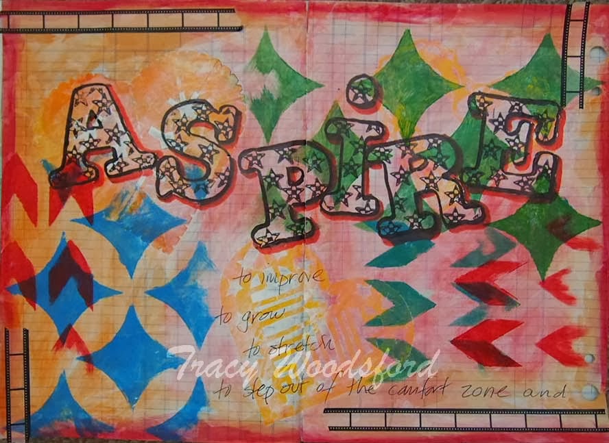
Aspire is the Word-Up for this month. Check it out here. Join in the fun to be in with a chance to win a stencil!

This was an ultra-quick, don't-stop-to-think page, as it usually is when I break out the stop-motion camera. You can see the video at the bottom of this post. The extreme heat we're having here at the moment means all the layers dry virtually immediately, which helps :)


Wednesday, 7 August 2013

Seize the day!


'Seize the day' is the colour-this-quote challenge over on Artists in Blogland for this month. I decided to seize the opportunity to make another video. I find the pressure to keep going and complete the whole page within a short period causes me to make more pared down pages. I only use what's around on the desk and don't really have time to think about what I'm doing. Sometimes that can be fun!


Tuesday, 9 July 2013

Summer of Colour - Week 5


If you haven't joined in the Summer of Colour yet, there's still time! Just click on the button in the sidebar and find out what it's all about. 

The colours for this week are red and yellow. I decided to combine this week's colours with the Art Journal Journey prompt for July - architecture.

Thinking about how a city changes over time led me to the idea that just as the skyline of a city changes, so does our internal architecture. 

The old buildings that stay around are our core values and beliefs, the things that stand the test of time. For me that would be my faith. 

Then there are the new buildings that spring up. Sometimes they stay around and at others they are demolished when they prove to be unsound. A bit like friendships that sometimes spring up but only last for a season. 

As neighbourhoods go through regeneration, so we sometimes pick up an old hobby or an old habit and renew it. 

So how's your internal skyline?


Wednesday, 3 July 2013

Summer of Colour - week 4


Charcoal grey and pale pink were the chosen colours for this week (see button in the sidebar to join in the fun). I have to say I'm not really a pink kind of person unless it's hot pink paired with orange - a previous colour choice for this challenge.

I've found that using the time-lapse camera can make me feel a little pressured in making decisions. I usually work on pages over a couple of days, letting each layer dry and thinking about what comes next. You don't have that luxury with the time-lapse because you can't pause it. So I thought that this time I would pick out some materials to use, limiting myself only to those things.

The things I noticed about this page when it was finished: I didn't use any paint or gesso, I used lots of tape, and there's lots of white space.

Sometimes it's good to restrict yourself. You force yourself to consider options other than the ones you usually reach for. And the results can be surprising.


Tuesday, 2 July 2013

Gelli play


What to do with all those gelli prints? Because you know that it's addictive and you end up with piles of the things...

And what design to use for new business cards? I've stamped them before, printed an artwork on one side, embossed them. What now?

How about joining the two?

So here they are, ten new business cards using gelli prints and a mini-vid of how they were put together. 


Once they were cut up I stamped 'ART' on to the front. The back already had all my details as I wasn't sure if the decorated card would go through the printer. And here's a close-up of the finished cards.


Now I'm off the Carolyn Dube's July Gelli Print Party to see how everyone else has been using their prints just lately. 

Tuesday, 11 June 2013

Summer of Colour Week 1

The Summer of Colour is back! (See the button in the sidebar under I link up at...) The colour prompt for this week is turquoise and citron green. Hop on over there to join in the fun.

I'm doubly excited because my husband bought a new toy which he has let me play with. Here it is:


This is a time-lapse camera, so if all goes well, there will be a little video below of how I made this page to answer the prompt.


Once I'd put the colours on the page they looked like grass and sky and just reminded me of the summer (although summer here tends to be more brown than green, but my English roots still tell me that green is a summer colour :))

And here are some close-ups of the sunflower stamp which I had made from my own drawing:


And here's the time-lapse video. Next time I'll remember to turn the page round at the end!